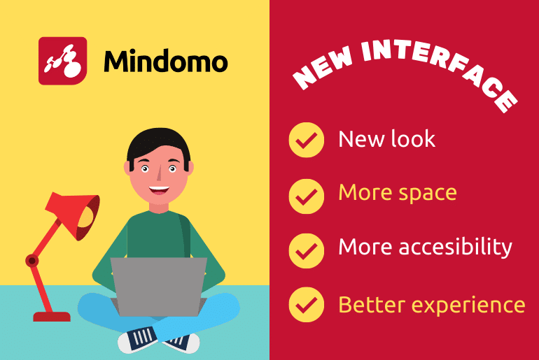
Our goal is to have an app that is user-friendly and satisfies all our users’ needs. We do our best to improve the app based on their suggestions. As a result of your preferences and our ideas of developing the app, now Mindomo has a new graphical interface that is even more engaging and intuitive.
Reasons for redesigning the user interface
Some of the reasons for redesigning the user interface are:
- To make it more attractive to users
- To make it more user-friendly so that the new users can understand faster all the features
- To make more space on the canvas for the map
- To make key functionality easier to find and to bring all the actions closer to reach
Mindomo has so many features because we usually update the app based on your feedback and are trying to satisfy our users’ needs. Sometimes, it could be a little difficult for new users to learn all the features, so we came up with this solution. We kept the features, but we thought about ways to make them easier to discover and use.
You can still use the old version until the 1st of June. After this date, only the new version will be available.
What is the news?
1. New interface – fresh look for a better experience
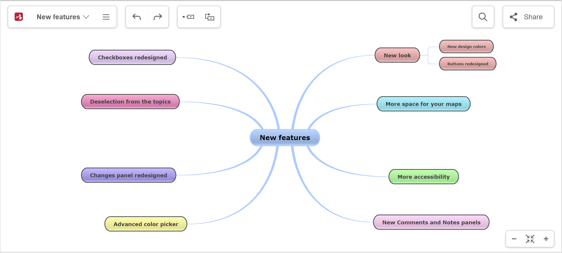
The new design aims to improve the user experience and have everything handy. Now, the buttons for each feature are easier to find.
This time, the white color of the canvas was also used on the buttons. The two gray sidebars have disappeared, leaving more space for the map on the right side of the canvas. At the top, only the white buttons with a gray border remained, which makes them easier to notice and interact with.
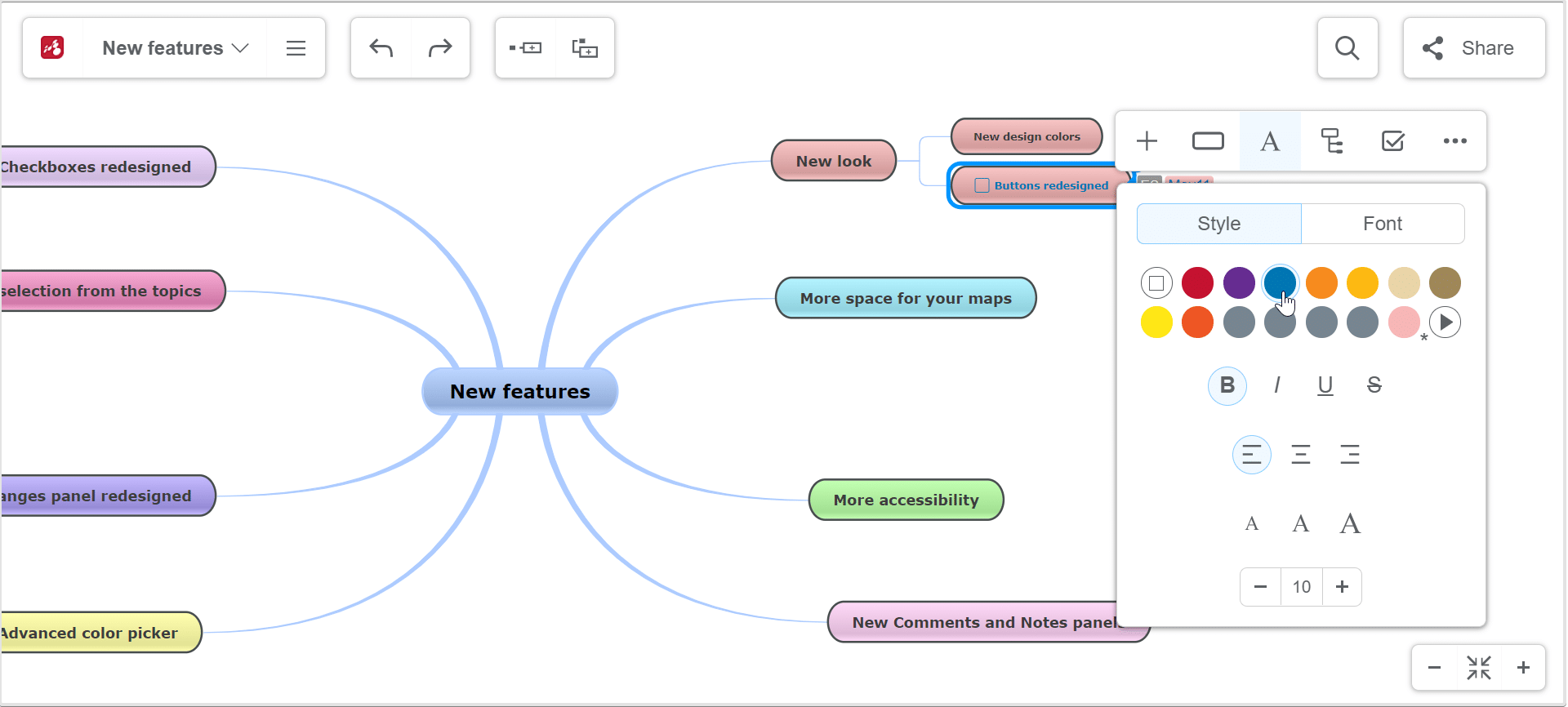
We redesigned buttons to offer a new look and feel. Here are some examples of the buttons that are now white and have new display icons:
- Topics and subtopics creation buttons
- Share diagram button
- Share inside map button
- Button for searching across all maps, your maps, and the ones made public in Mindomo gallery (the title of the map you are in will appear on the button)
- Button to return to your Dashboard
2. More space for your maps
Besides the fact that the interface looks better now, the design is minimalist, and you get more space on the screen for your mind maps, concept maps, timelines, etc.
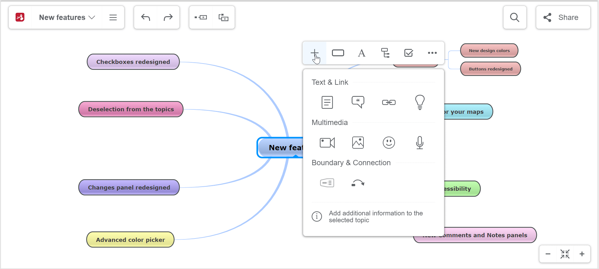
We removed the left side toolbar from the app interface and moved all its features in the topic’s context menu. In other words, now you can add hyperlinks, attachments, images, icons, video, audio, and recordings directly from the context menu.
The Theme button was moved in the File List Menu. From there you can change between existing themes, create your own theme, and Import or Export a theme.
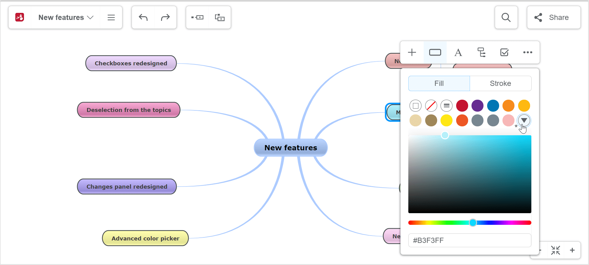
3. Advanced color picker
To expand your range of color choice and combinations, we have introduced a new Color Picker.
In addition to the suggested colors, you can choose any color you want and the last colors used are saved so you can use them later. You can find the Color picker in the Topic customization tab, Text customization tab, and Layout and lines customization tab and background tab to use colors and save them for later editing.
4. More accessibility – all the actions are closer to reach
The left side toolbar moved in the context menu. It has a new structure that helps the user have everything in handy. It is easier to use and all actions are intuitive. You have the opportunity to find the feature you are looking for by making fewer clicks than before and in this way save time to accomplish more tasks.
We also have an improved and easily accessible context menu organization where you can find all the features related to topic and topic elements customization.
The context menu that opens when you right-click on a topic
It offers you the following options:
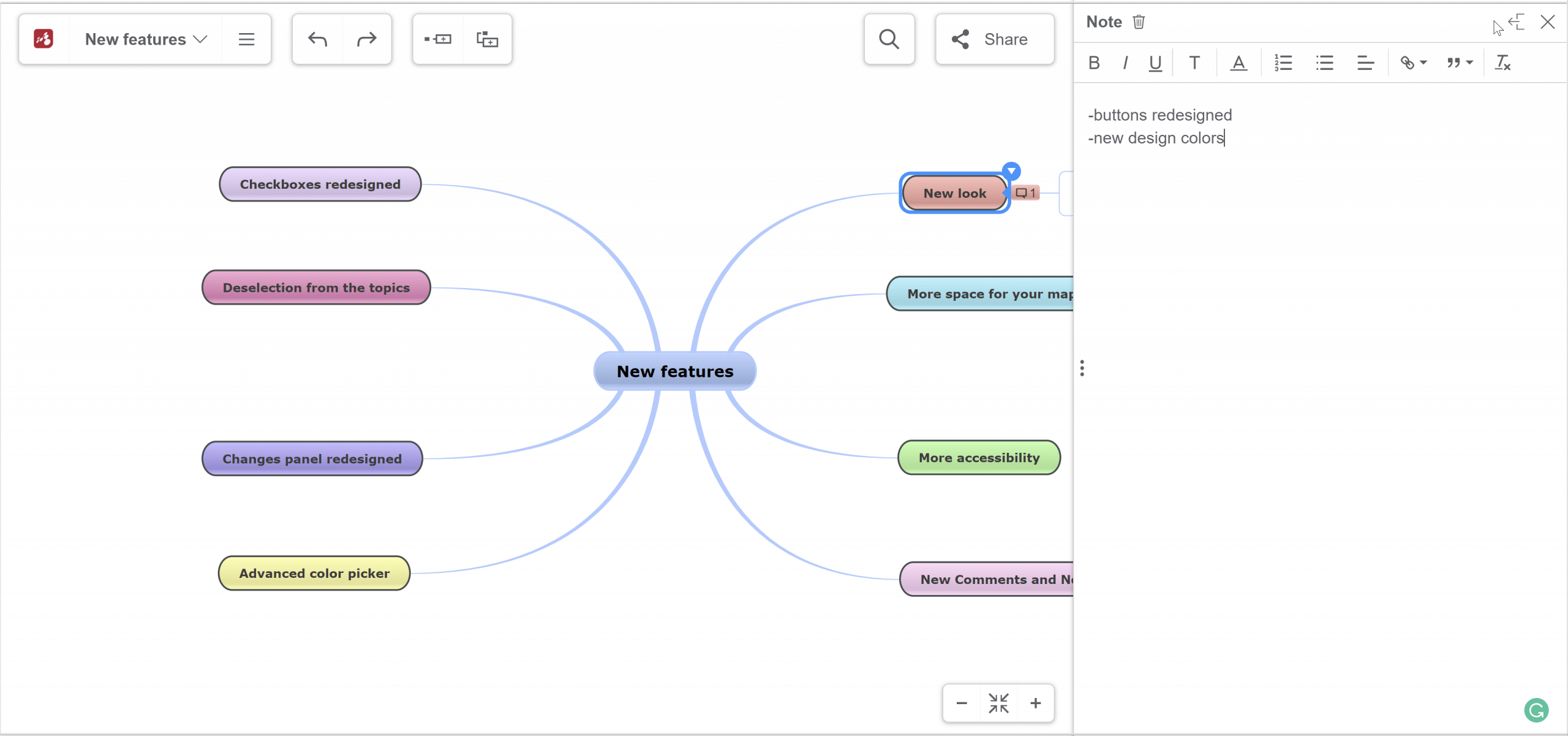
Adding topic-related information
From this selection, you can add text in the Notes section, details to your topic in the Comment section, or hyperlinks. You will also find here the multimedia panel, so you can add images, videos, icons, and recordings from the same selection. You can insert a relationship between two topics and also set a boundary – determine the limits of an area on your map.
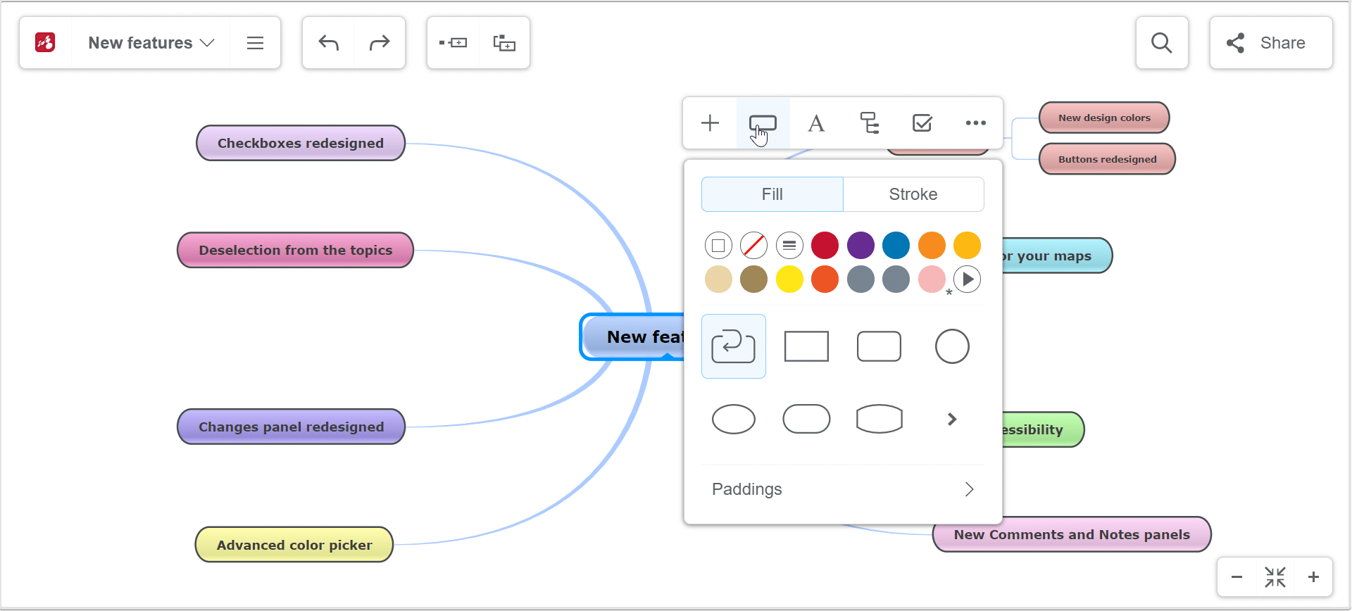
Topic customization
From the topic customization tab, you can change the color and shape of the topic. You can also customize the topic paddings. Check out our “How to mind map” page to learn why more options of customization help you build better diagrams.
Besides changing the topic’s background color, you can also customize:
- The Stroke – set the topic’s border color from the color picker or choose to take line’s color
- The Topic style – with or without gradient, with or without border
- Topic’s border weight
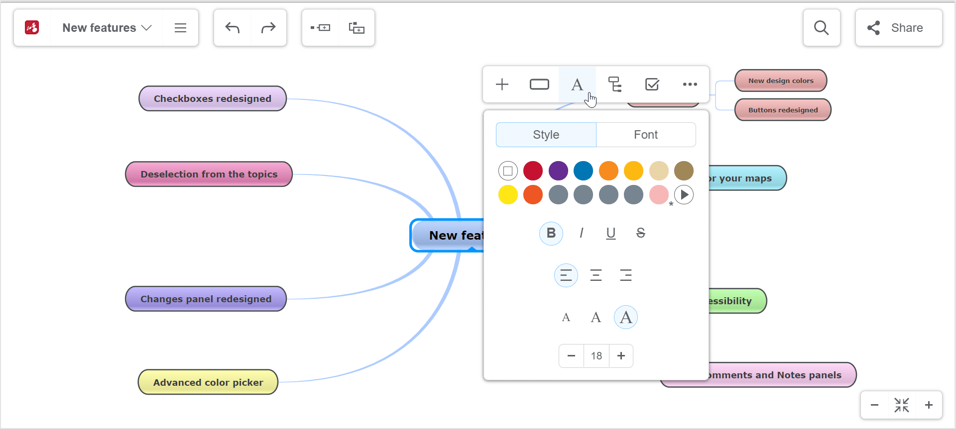
Text customization
From the text customization tab, you can change the style of the text (color, alignment, size, etc.), and font.
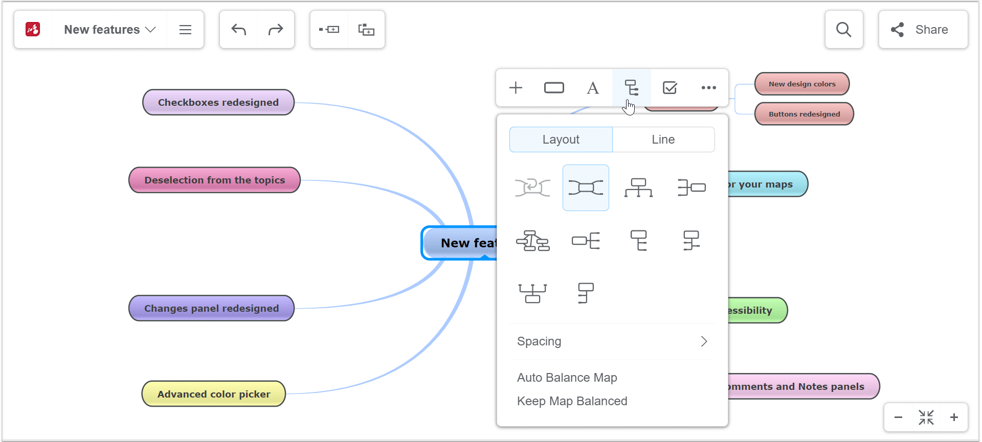
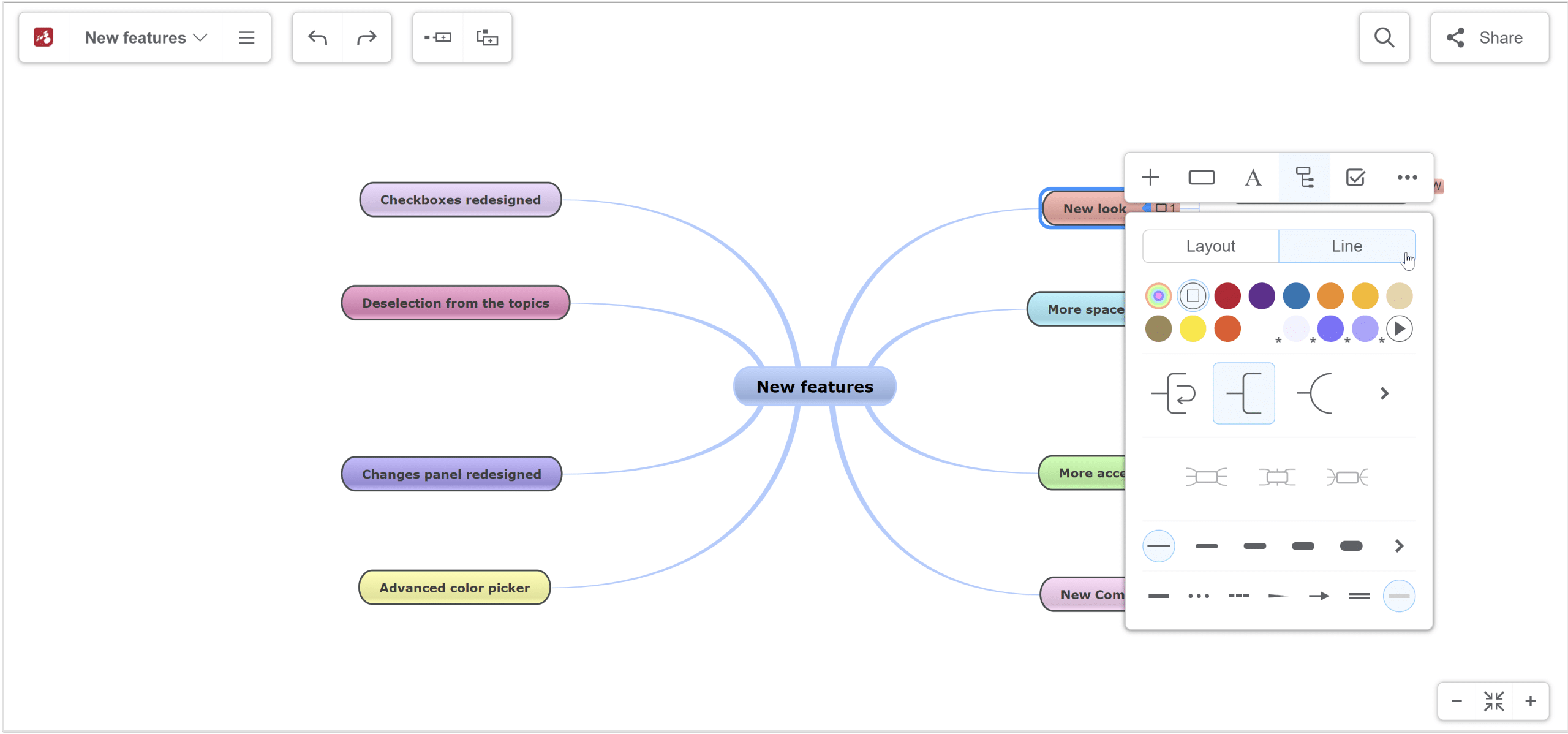
Layout and lines customization
From the Layout customization tab, you can choose from several layout types and set the spaces between topics and branches. Also, you can Auto Balance the map or keep it balanced all the time when you are editing it.
From the Line tab you can edit the connections.
Connection line’s color
You can choose the color from the color picker. You have more options:
- Choose from the default colors
- Create new colors using the color picker (by clicking on the arrow)
- Add a color code (by clicking on the arrow)
- Use multicolor palettes (by clicking on the colored circle)
Connection types
Choose between different types of connection: straight, arc, rough, curve, elbow, rounded elbow, angle, no line.
Anchor points
Set the anchor point of the connections.
Weight of the connections
You can also edit the connection weight.
Line format
Choose from solid, dotted, dashed, tapered, arrow, triple, or default.
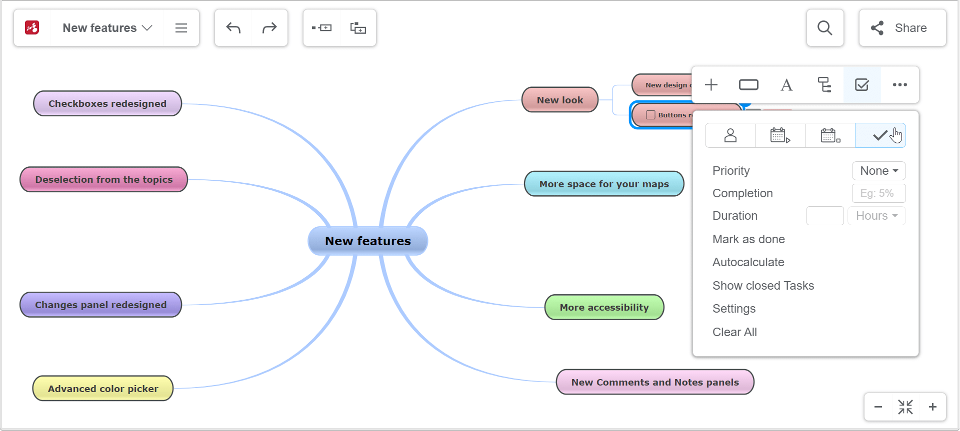
Tasks management
This tab allows you to set tasks on a chosen date and assign them to yourself, to a Mindomo user, or a ghost user. You can change the priority, completion percentage, duration, mark them as done, etc.
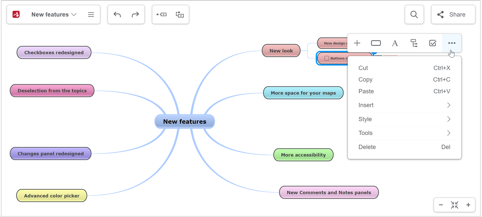
Copy-paste options
Here you have the option to Cut, Copy or Paste topics or to Copy, Paste or Clear topics style.
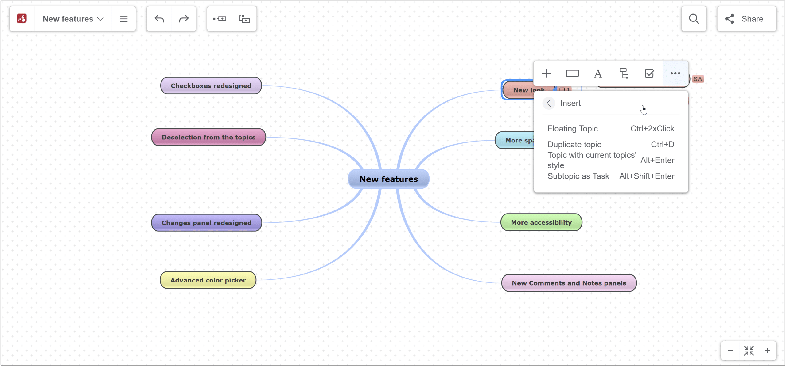
Insert options
From the Insert section, you can insert a floating topic, duplicate the selected topic, create a topic with current topics’ style, create a subtopic as a task.
Tools
From the Tools section, you can edit the map as a template, Set the subtopic as a task, Copy and Paste branches, number topics that you will insert, view changes for the selected topic, create a new map from a certain branch, Drill down to have a better view of a specific topic from the map and edit it, etc.
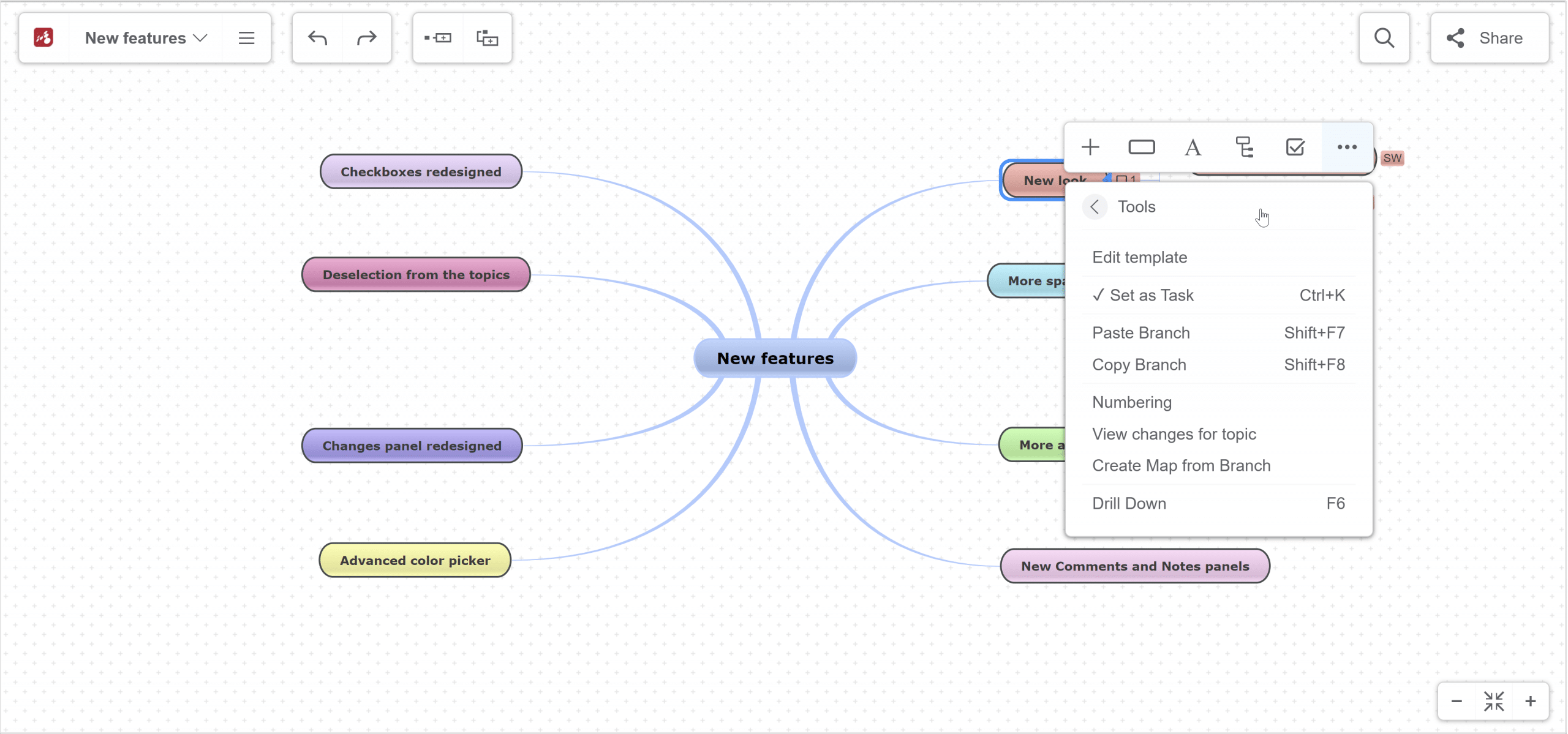
We redesigned the context menu to make it even more compact, well-organized, and with almost all key features at one click away.
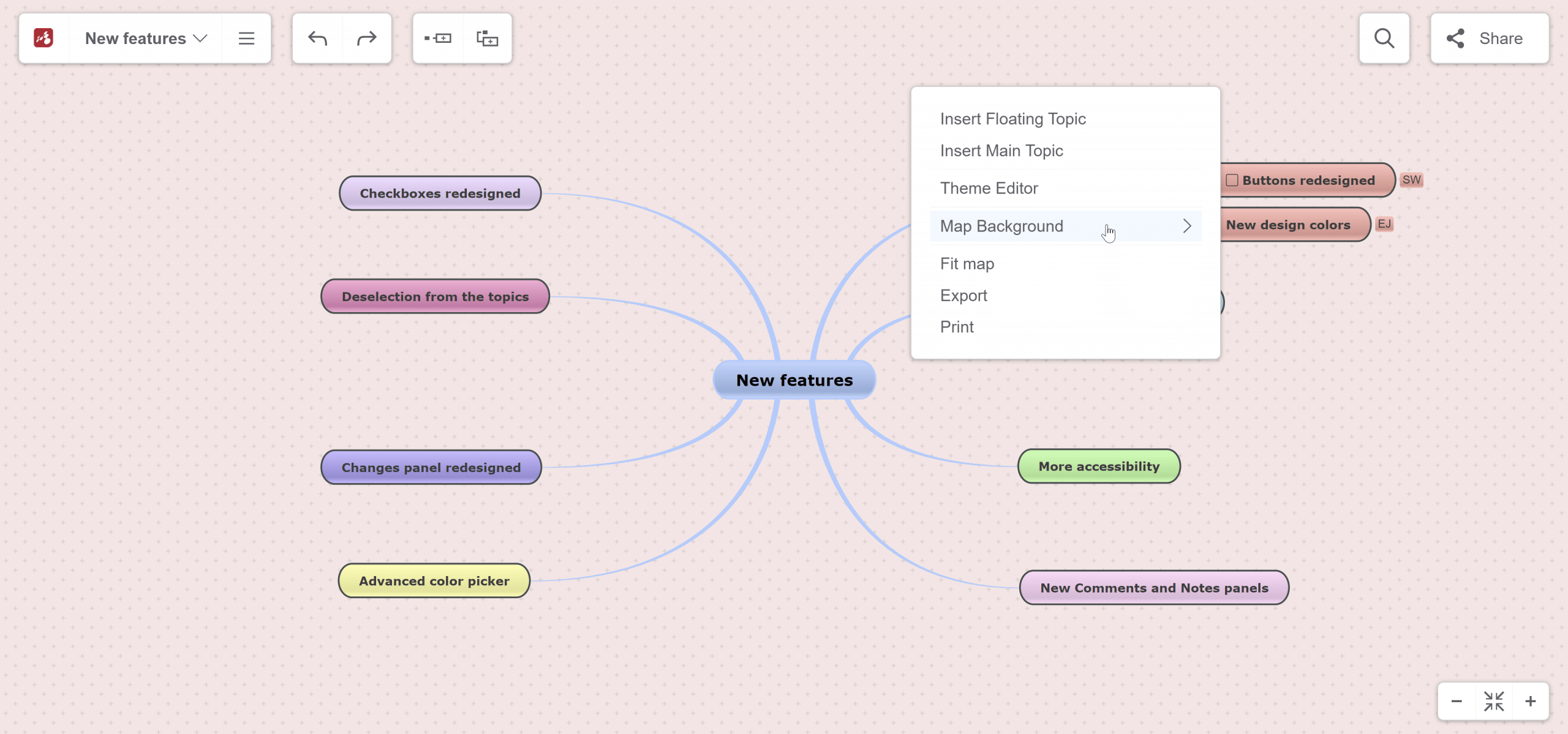
The panel that opens when you right-click on the canvas
It offers you options related to the canvas and map view, such as changing the map background.
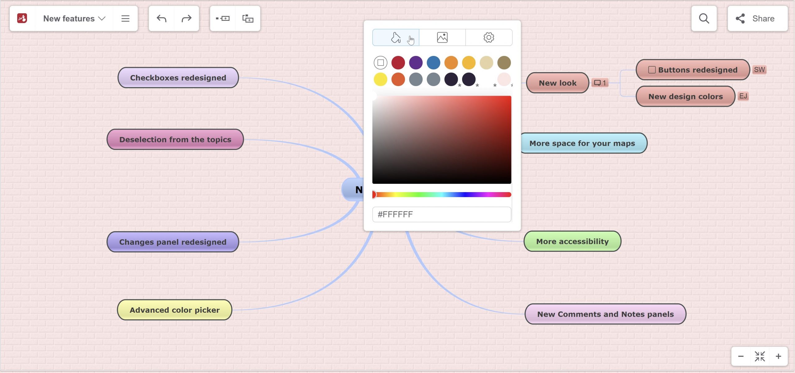
To change the background color of a map, right-click on the canvas and choose any color you want, either with the color picker or by inserting a color code. You can also add a picture as a background, or choose from the pattern suggestions from the app.
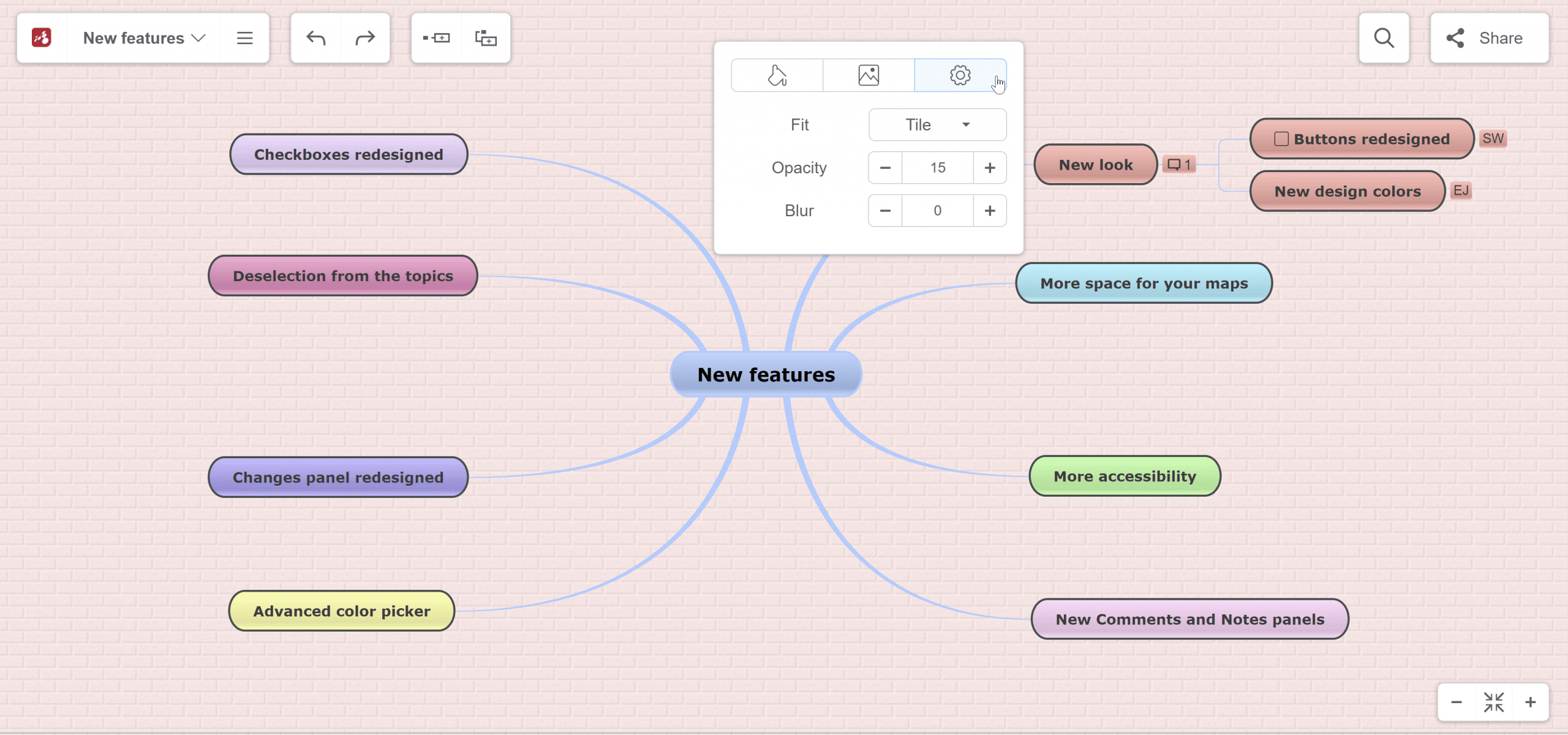
From the settings icon you can set the Fit, Opacity and Blur.
Besides changing the background, you can also use this panel to Insert a floating topic, Insert the main topic, edit the theme, Fit the map, Export or Print your map.
5. Checkboxes redesigned
When you right-click on a subtopic with a task and change the color of the text, the task’s checkbox will also change its color.
If you click on the arrow from the right, a color picker will open. You can select any color you want or insert a color code. The last colors used will be saved, so you can use them for other tasks.
6. Topic deselection
A feature that was required by our users and now was implemented is the deselection from the topics. In other words, now you can deselect all the topics, even if you are not in the view mode with a single click on the map background.
As you can see in the picture, none of the topics is selected. In this way, you will have a better view and understanding of how the map will look when it is printed or downloaded as an image or as a PDF document.
Now you have more space on the map and can deselect topics. Due to this fact, you can benefit from a more clear map to reflect on the content from it and generate ideas easier.
7. New Comments and Notes panels
The Comments panel and Notes panel were completely revamped. Now they have two states: normal and maximized.
When you go to the context menu and choose the option to add a comment, this is the panel that will open automatically. Expand this panel if you want to have a better view when you are writing the comment.
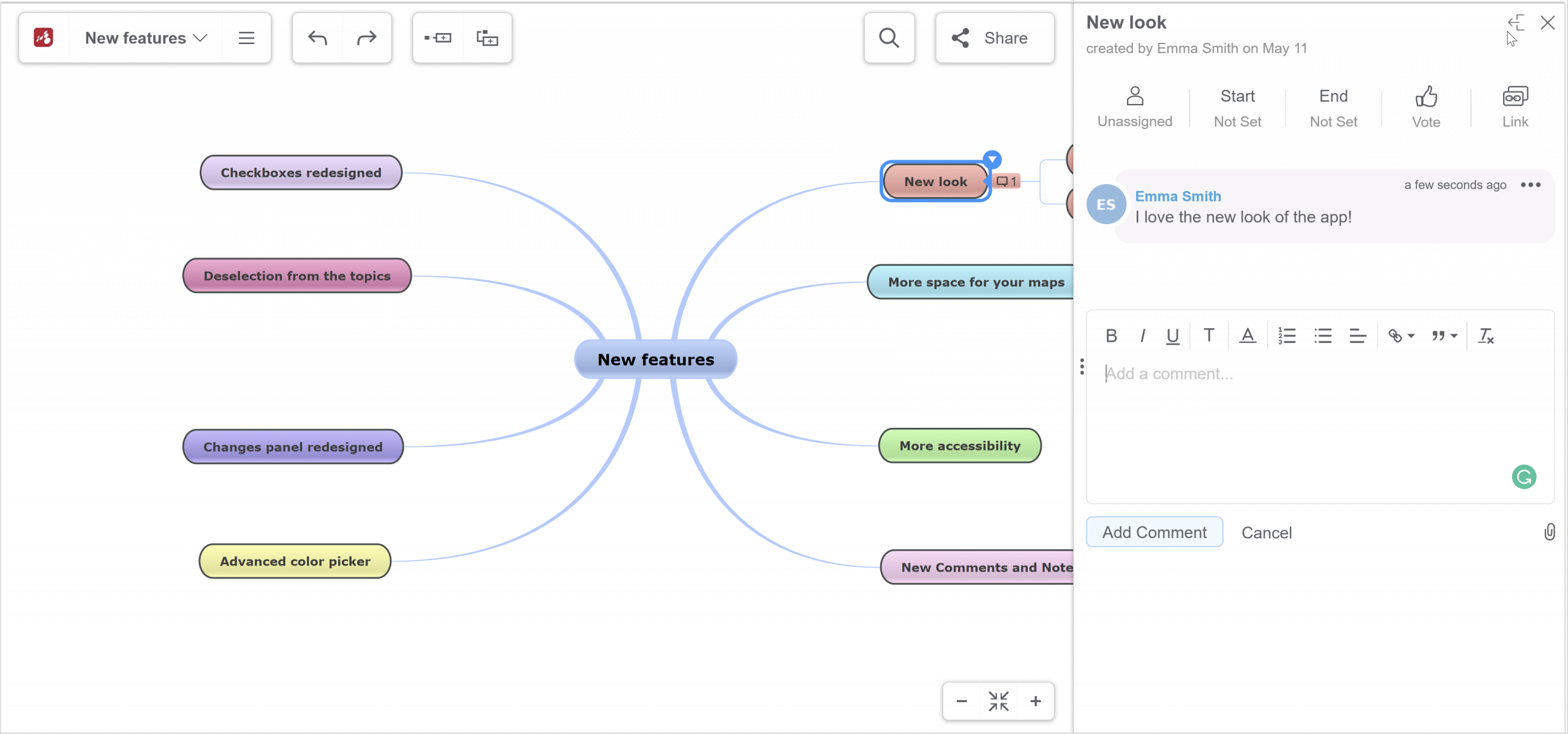
It’s the same for adding Notes. You can maximize the panel to have a better overview of the content.
8. Beautified timeline of map changes
The changes panel has been redesigned. You can find it in the File List Menu and check changes that have been made on certain days and hours. This feature is especially useful when working with a team and you need to keep track of task changes or in brainstorming sessions when you can check who came up with that brilliant idea and contact it for further details to implement it immediately.
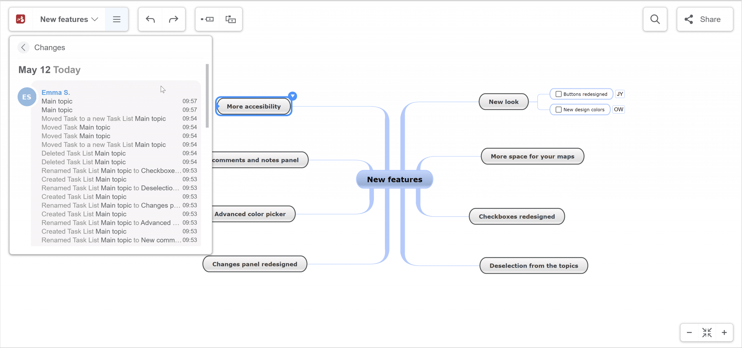
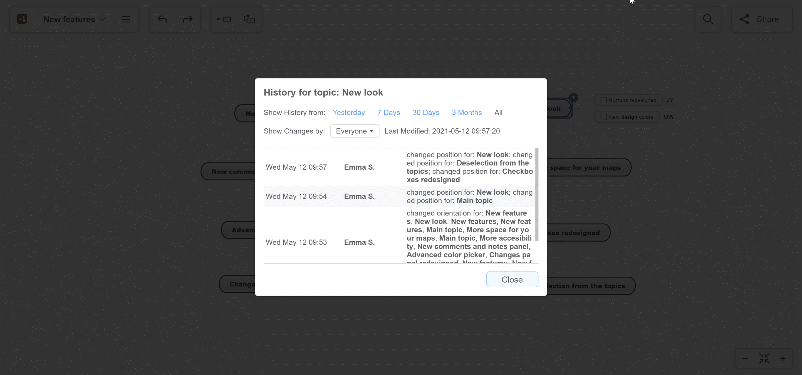
9. Timeline of topic changes
Also, now you have the option to view the changes that have been made to certain topics, not only on the whole map.
You can see the changes from a certain period, seeing the whole history. You also have the option to see the changes made by a certain person.
We hope you will enjoy the new design and continue to create mind maps that are useful and stylish as well. Use the new look and extra space for brainstorming new ideas!
Keep it smart, simple, and creative!
The Mindomo Team
11 Comments
Hi,
Thank you for the updates. They are well received.
The ability to sort topic children alphabetically is important in my work.
Are you able to provide this feature any time soon?
Thanks
Bryan
Hi Bryan,
Thank you for your suggestion! This feature is on our list and we plan to implement it soon. Stay tuned.
Thanks,
Isabela
Hi,
When working with large maps, the ability to expand and collapse levels is important.
Can we please have this gesture added?
Thanks.
Hi Bryan,
We already have that option. Here you can see how to Expand/Collapse topics: https://help.mindomo.com/basics/shortcuts/#expand-collapse
If you are focused on the central topic and press “Space” all levels collapse. With CTRL + 1/2/3/4 you can collapse on levels (show 1/2/3/all levels of subtopics and collapse the rest).
Thanks,
Isabela
The new UI is beautiful and is a great fit with the nature of mind mapping. However, will the new UI be available for the desktop version of Mindomo?
Hi Robert,
Thank you so much for the feedback! We are happy you like the new UI!
Yes, it will be available soon for the desktop version.
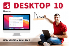
Hi Robert,
We have launched the new Mindomo Version for Windows and macOS. You can see all the new features presented here: https://www.mindomo.com/blog/mindomo-10-for-desktop/
Looks great! When will we be able to add images to our notes?
Hello Torgrim, thank you for your feedback, we are happy to hear that you like it. Adding images to your notes will be a new feature available soon. Stay tuned.
Great Job Mindomo Team ♥ ♥ ♥
I loved the new fresh look
while the old interface flexes its muscle with core functionality right in front of your eyes
the newer interface takes more modern minimalist approach while still keeps all powerful functionality underneath
Hello Mohammed. Thank you so much for this feedback. So glad to hear that. Enjoy the new Mindomo!